3 Simple eCommerce Tips
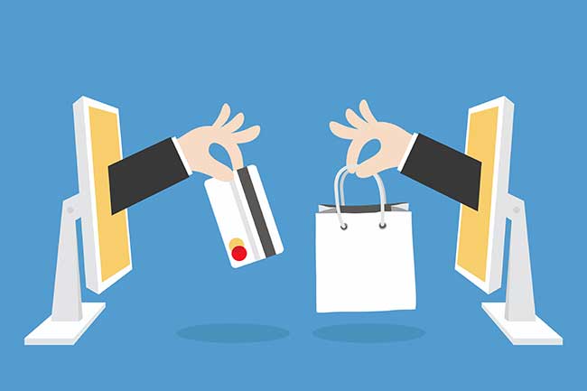
Today, technology has inevitably become part of each person’s life, providing convenience and accessibility in more ways than one. E-commerce is now the most popular way to shop for billions of users. Over time, however, competition has intensified as more and more businesses see the benefits of having an online store. Thus, offering a superb customer experience and quality products in this sales channel is extremely important.
As with any other business strategy, the true success of e-commerce is indicated in the numbers, specifically your sales. Since you are working in the digital space, one of the ways you can boost conversions and sales is by making use of effective web design. Site design is an underrated factor that some business owners overlook when trying to increase sales. However, it is vital. A well-designed and optimized website can help boost site traffic and ultimately lead to more conversions.
Follow these three quick, easy, and simple web design tips and principles to improve your conversions. By offering the best possible customer experience and building a reputable brand image, you can expect your sales to increase gradually.
Tip #1: Simplify Navigation and Checkout
When customers shop online, they want it to be easy to navigate through your products and, more importantly, check out once they are ready to purchase something. Thus, navigation design is a crucial element of any e-commerce website. When designing this part of your site, simplicity is key, and one thing to take note of is that you want to minimize the number of clicks that customers have to make to add to their cart and check out to pay.
The first thing you can do is check to see if you have unnecessary graphics or text on your products’ information pages. Stick with what is most important and relevant for customers so that users can get the point right away. Similarly, get rid of any form fields that are not absolutely needed to complete an order as customers can get discouraged after seeing how long the form is.
In terms of product segmentation, your navigation panel must include your main product categories. Avoid nestling your products into several levels of categories and try to stick to your main ones. This way, customers do not have to click multiple times before finding what they are looking for to begin with.
Tip #2: Think About Color Choice
Color choice is an important part of your branding strategy, and while you may have already considered it in the initial design stages of your site, it will also be helpful to think about how customers perceive certain colors. A good color scheme will attract customers’ attention and trigger positive responses that will encourage them to check out your site and shop through your products.
If you are still in the process of developing your brand, it helps to know what message you want to send and convey to customers as this is part of building your reputation. Familiarizing yourself with color psychology in branding will be helpful as it gives you a better understanding of how customers may react to certain colors. For example, yellow gives off a sense of optimism and warmth, while red gives off a sense of boldness and excitement.

Besides thinking about what color represents your brand message well, you must also incorporate design principles like complimentary colors and be consistent with your color choices. As much as possible, sticking to around two main colors will be sufficient. You can also add another color for important buttons where you want to draw attention. For example, you can make your call to action (CTA) buttons brighter-colored, so they are easier to see.
Tip #3: Emphasize Calls to Action (CTA)
In addition to making your CTA buttons brighter in color, it is important to create visual attention around your CTAs. Since you are essentially trying to get customers to click on these, you naturally want to design the buttons in a way that grabs their attention. If users never notice your CTAs, you risk losing potential conversions or sales.
To emphasize your CTAs, you can do things like make the text bold, place a big arrow pointing to the button near it, use eye-catching colors, or use a human model that looks at the button. (For example, place a large button that says “Sign up now!” in bold text, so it stands out more than other elements of the page.) Your goal is to visually point to the CTAs. You want to put yourself in your users’ place and see what will cause them to look at the important buttons!
Good Design Leads to More Sales
The web design is a critical aspect of your e-commerce site to consider because as it is one of the most important factors affecting conversion rate optimization (CRO). Your site design needs to be not only visually pleasing but also strategic. You want to think about the customer journey and tackle all the touchpoints they will go through while navigating your site. By doing so, you can make the online shopping experience as simple and seamless as possible, thus boosting your conversion rates and potentially generating more sales.
Seota has Shopify Experts & WooCommerce Experts on staff. (As well as Magento, but we are leaning away from the platform at this time,)


